The Modera Typeface: A Bold Statement Font for Digital Design
I was redesigning a landing page for a creative entrepreneur—a photographer with a minimalist aesthetic who needed a bold headline to capture attention. Every sans-serif option felt too safe. I wanted a statement font, something with undeniable presence. That’s when I stumbled upon Modera. The moment I typed ‘PORTRAITS’ into the hero section mockup, the entire layout clicked. The characters are thick, confident, and undeniably modern. This isn’t a whisper; it’s a declaration. That initial experiment turned into a deep dive, and after applying Modera across several web projects, here’s my hands-on review.
The Digital Personality of Modera
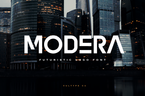
Modera is a display font with a cool, futuristic edge. Its thick letterforms create a sense of solidity and importance, while its overall clean structure keeps it from feeling overly decorative or whimsical. The mood is modern, assertive, and slightly avant-garde. It brings a premium feel to digital spaces without being corporate. In a hero section, it commands attention; as a section heading on a landing page, it creates a clear and confident visual hierarchy. For web designers, this is a font that solves a specific problem: when you need a headline to feel like the most important piece of information on the page, visually and emotionally.
Web Applications Where Modera Thrives
This font is built for the digital stage. Its strengths shine in specific areas of a website or online brand experience where impact is paramount.
- Hero Headlines & Landing Page Titles: This is Modera's home turf. On a portfolio homepage, a bold ‘CREATE’ or ‘DESIGN’ instantly sets the tone. For a product launch page, the product name in Modera feels innovative and substantial.
- Key Section Headings: Breaking up long sales or course pages with Modera headings helps users scan and understand the value propositions immediately. ‘THE PROCESS’, ‘WHAT YOU’LL LEARN’, or ‘FEATURES’ all gain visual weight.
- Call-to-Action Text: While not for tiny button labels, using Modera for a prominent, standalone ‘GET STARTED’ or ‘DOWNLOAD NOW’ on a page can be incredibly effective.
- Online Store Banner Graphics: For promotional banners announcing a sale, new collection, or seasonal campaign, Modera delivers the message with punch.
- Logo Text for Digital Brands: For brands wanting a modern, typographic logo, Modera offers a strong foundation. Its distinct character shapes can become a recognizable part of a brand’s digital identity.
- Blog Post Feature Titles: On a blog focusing on design, tech, or creative business, using Modera for the featured title of major posts can elevate the editorial feel.
Readability and Practical Considerations for the Web
A font’s beauty must be matched by its practicality on screens. Testing Modera across devices revealed some important best practices.
On desktop, it performs excellently at larger sizes. Its bold weight ensures it remains clear even over subtle background images. On mobile, however, you need to be mindful. While still readable, its thick strokes can feel a bit heavy if used at excessive sizes on smaller screens. I found that slightly scaling down headline sizes for mobile breakpoints maintained the impact without overwhelming the viewport. For responsive design, it’s crucial to test.
Modera works beautifully on both light and dark backgrounds. Its solid forms hold up against dark colors without needing an extra stroke, and on light backgrounds, it provides maximum contrast. It’s not ideal, however, for long body copy, navigation menus, form labels, or any dense textual interface. Its role is purely display. Using it for a paragraph would be a severe misstep, creating a cramped, difficult reading experience.
Smart Font Pairing for a Cohesive Digital Identity
A bold display font like Modera needs a calm, readable partner. My go-to pairing is a simple, highly legible sans-serif for all body text, form fields, and smaller UI elements. A font like Inter, Open Sans, or Roboto creates a perfect balance. The combination says: “Here is our bold statement (Modera), and here is the clear, helpful information (the sans-serif).” For a more editorial or classic digital brand, pairing Modera with a clean serif for body text can also work, adding a touch of sophistication to the modern base.
Avoid pairing it with another bold or highly decorative font. The goal is contrast and hierarchy, not competition.
Before You Commit: Licensing and Technical Checks
If you plan to use Modera for client websites, your own online store, or digital templates, always verify the commercial license. Ensure it covers web embedding. Many premium fonts now include webfont files (like WOFF2) or provide clear instructions for self-hosting. Check for the font weights included—often a display font like this comes in a single, potent weight, which is perfect for its intended use. Also, look for multilingual support if your project serves a global audience; this ensures special characters render correctly.
From a UX perspective, remember that while Modera adds tremendous visual appeal, it should not compromise accessibility. Always maintain sufficient color contrast between the font and its background, and ensure it’s used as a visual enhancement to a well-structured, logical layout.
When Modera Might Not Be the Right Choice
It’s important to recognize where this font shouldn’t go. Beyond long paragraphs, avoid using it for:
- Legal disclaimer text or dense terms & conditions pages.
- Small secondary navigation links.
- Dashboard interfaces or data-heavy application UI.
- Any text where ultimate readability and speed of comprehension are the sole priorities, such as instructional steps in a checkout process.
In these cases, a font’s personality is a distraction, not an asset.
My experience with Modera has solidified it as a go-to tool in my digital design toolkit. It’s not for every project, but when a website needs a confident, modern, and slightly futuristic voice, this typeface delivers that voice with clarity and strength. It transforms a standard headline into a design element that carries weight, setting the tone for the entire digital experience below it.